
The Creative Process Behind Nutanix’s Test Drive Redesign
In today’s fast-paced tech landscape, delivering an intuitive and engaging user experience is essential. This belief drove us to revamp our Test Drive platform at Nutanix. In this article, I’ll take you behind the scenes of our redesign process — from pinpointing the initial challenges to implementing creative solutions that elevated the user experience.
What is Nutanix Test Drive?
Nutanix Test Drive offers a hands-on exploration of Nutanix’s enterprise cloud solutions. It allows potential customers and partners to try our products in a controlled, risk-free environment. Whether you’re an IT professional or a business decision-maker, Test Drive lets you evaluate the value and capabilities of our offerings without the hassle of complex setups or installations. Think of it as a cloud solution playground!
Discovering the challenges
The Test Drive platform, initially developed as a quick, makeshift solution, lacked brand cohesion, suffered from usability issues, and had an overall uninspired aesthetic.
To address these issues, we started with a comprehensive experience evaluation to assess the platform’s current state and identify gaps. This involved a detailed UI audit, where we graded each page to determine whether it required minor adjustments or a complete redesign. Additionally, we conducted qualitative research by surveying 30 users to gather valuable insights into the overall user experience.
The audit revealed major inconsistencies with other Nutanix products, including layout, hierarchy, and visual design, resulting in a fragmented user experience. User surveys further uncovered critical issues: the platform’s workflow was unclear, and the processes for reserving, starting, and navigating a test drive were cumbersome, causing frustration among users.
A pivotal moment during the redesign was the introduction of Nutanix’s new branding. This added a fresh layer of complexity: aligning the Test Drive platform with the updated brand while ensuring it felt consistent with the main Nutanix website (Nutanix.com). Since Test Drive serves as a bridge between the main Nutanix website and the products, it needed to reflect both the marketing identity and the product experience. The challenge was twofold — how do we seamlessly connect the main Nutanix website experience to the actual product within the Test Drive platform, and resolve the inconsistencies and usability issues uncovered in our research? It was time to get creative.

Overcoming Challenges with Creativity
Introducing The Design System
As a visual designer on the Nutanix Design System team, this was my first time leading a full platform redesign, including the UX aspect. I felt a mix of excitement and apprehension knowing Test Drive would be the first product launched under the new Nutanix brand. Without established guidelines, I was starting from square one, laying the groundwork for the redesign. To tackle this, I created a unified design system — a comprehensive collection of visual styles and reusable components not just for Test Drive, but intended for use across all Nutanix web applications. This design system became the cornerstone of the redesign, ensuring consistency across the platform while elevating the user experience.
Core Elements of the Design System
Foundations, AKA Style Guide
- Colors: Branding was at the heart of this process. I carefully curated a color palette that aligns with Nutanix’s new brand identity, selecting colors for text, buttons, backgrounds, and other UI elements. I took the core purple and charcoal gray from the brand and created several subtle variants to introduce depth and visual interest while maintaining consistency across the platform. Each variant was carefully balanced to ensure proper contrast ratios, particularly for accessibility, so that the design not only looked vibrant but also met usability standards. Every color choice, from bold accents to muted backgrounds, was made with a designer’s eye, ensuring the palette felt cohesive, visually appealing, and functional across all user interfaces.

- Typography: To reflect the company’s personality and style, I used the rebranded font for large headings, perfectly aligning with Nutanix’s new voice and tone. For paragraph text and other smaller elements, we opted to use the product font, ensuring consistency with the product side while maintaining legibility. The challenge in building the typography system was achieving consistency while preserving hierarchy and readability. I started by establishing a base font size, creating a harmonious type scale, and defining consistent naming conventions and proper type settings to ensure both structure and legibility across the platform.

- Spacing & Grid: Proper spacing establishes visual balance, rhythm, and hierarchy, making the UI more intuitive and easier to navigate. I implemented an 8pt grid system, a modern design standard, combined with a non-linear spacing scale to maintain consistency and enhance vertical rhythm throughout the interface. This approach ensures a cohesive and visually pleasing user experience.

Components
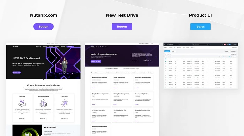
One of the key challenges was aligning Nutanix’s new brand identity with the components of the design system. For example, the new Nutanix branding, driven by the marketing team, introduced pill-shaped buttons, while the product UI traditionally used buttons with rounded corners.
Since Test Drive serves as a bridge between the main Nutanix website and the products, it needed to reflect both the marketing identity and the product experience. Pill-shaped buttons, with their soft, elongated appearance, feel modern and are especially touch-friendly for mobile interfaces. However, their larger size and additional padding mean they occupy more interior space, making them less adaptable to tight layouts or designs that prioritize content density. They can also feel less formal, which may not align with all product contexts.
On the other hand, buttons with rounded corners strike a balance between modernity and professionalism. Their compact shape allows for more flexibility in layout design, making them easier to fit into smaller or more constrained areas without overwhelming the user interface. Rounded corner buttons also offer a more neutral, polished look that works well across a variety of design styles, from sleek marketing pages to functional product interfaces.
After several design iterations, we decided to adopt the new brand colors while retaining the rounded corner button style. This decision ensured consistency with the product’s design language, maintained a space-efficient layout, and provided a smoother transition between the marketing site’s visual identity and the product interface.
To provide broader context, the rollout of Nutanix’s new branding is happening in phases. Phase 1 focused on the Nutanix.com website, followed by Phase 2, which includes web applications like Test Drive and My Nutanix. Phase 3 will involve updating the product UIs. This phased approach allows for a gradual transition, which is why some product interfaces still feature blue buttons temporarily, as the new branding is progressively integrated across all Nutanix platforms.
Creating a User-Friendly Experience
With consistency and aesthetics in place, we then shifted our focus to enhancing the user experience. We reimagined the entire process, beginning with a deep exploration of user personas and mapping out the ideal user journey. By rethinking workflows, we aimed to create a smoother, more intuitive experience.
Finding Your Perfect Test Drive Made Easy
Navigation was a major challenge, with user feedback highlighting the frustration of finding specific Test Drives to try. To resolve this, we introduced a prominent “Launch Test Drive” button for easy reservations and implemented a dual-tab system on the landing page: ‘Explore by Solutions’ and ‘Explore by Nutanix Products.’ Additionally, we added a global search bar with filters, significantly reducing the time spent finding specific Test Drives. All available Test Drives are now organized in a card format, offering more options upfront for users to explore.
We also prioritized interactive elements. When users hover over a Test Drive option, the tile expands to reveal the top three reasons to choose that particular drive. This dynamic feature adds interactivity to the page while helping users make more informed decisions.
Optimized Login Experience
User feedback revealed that the login process was cumbersome and confusing, particularly regarding multi-factor authentication codes. Problems like missing emails or broken links led to a decline in user registrations and product trials. To streamline this, we collaborated with the engineering team to redesign the login workflow. Known users now receive a welcome message and a pre-populated email field — one click on the continue button sends an access link and code directly to their inbox. MyNutanix account holders can log in seamlessly with their existing credentials.

Revamped Dashboard
The previous dashboard lacked structure, featuring inconsistent layouts, poor use of white space, mismatched button sizes, and uncoordinated typography and icons, making it difficult for users to understand the layout or find, start, or resume their desired Test Drives. To address this, we completely overhauled the dashboard, introducing a clean and organized interface that mirrors the design of the landing page. Now, users are welcomed by a banner and introductory text, followed by an “Active Test Drives” section displayed in a horizontal carousel. This revamped layout provides a cohesive, easy-to-navigate experience for users arriving at the dashboard.

Turning Vision into Reality
Collaboration between designers and developers was key to bringing the redesigned Test Drive platform to life. We launched the refreshed platform during Nutanix’s .Next user conference, alongside user sessions to gather feedback. The response was overwhelmingly positive, with users praising the landing page’s modern look, streamlined discovery process, and optimized login experience.
 Learning and Growing
Redesigning the Nutanix Test Drive platform was both a challenge and a rewarding experience. The introduction of Nutanix’s new branding added an unexpected twist — bringing both excitement and complexity to the redesign. Integrating this fresh look into the platform required starting from scratch and building everything from the ground up. What initially seemed like a challenge quickly turned into an opportunity for innovation. We developed a unified design system that not only resolved design inconsistencies but also set a new standard for future projects, ensuring a cohesive and modern experience moving forward.
We then tackled core pain points, such as inconsistent design, confusing navigation, and a clunky login process. These challenges inspired creative thinking and close collaboration, resulting in solutions that significantly enhanced the user experience.
The Nutanix Test Drive redesign goes beyond a visual refresh — it reflects our commitment to delivering a seamless and engaging user journey. This project has laid a solid foundation for future innovations, where user feedback will continue to shape our improvements. We’re excited about the road ahead and are determined to keep pushing the boundaries of user experience.
PS: If you’ve enjoyed diving into our redesign journey, your support means the world to us! Give us a few claps 👏, share your thoughts in the comments, and don’t forget to explore the new Test Drive experience firsthand. Together, let’s shape the future of user experience!


